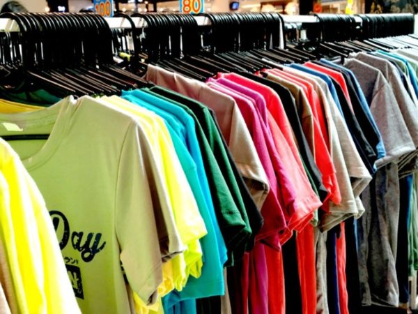
When printing t shirts it’s easy to rush into the process. Maybe you have a deadline to reach, or maybe you’re just overly excited about the end result! Either way, you’ll want to make sure you research the process properly and ensure you choose the right element to ensure your t-shirt design prints perfectly and looks great.
Luckily, here at Garment Printing, we’re experts in the industry, with over 20 years of printing t shirts… and we’ve already identified all these mistakes and written them down for you! So take a read of these 6 mistakes to avoid when printing T shirts so you can ensure you’re finished product is absolutely perfect.

Mistake 1: You rush into things
The first mistake is rushing into things without reading our tips below! So make sure you read these tips and know what to look out for. Some mistakes might seem tiny, but when you’re ordering a lot of personalised t shirts for your business, you want to avoid all possible mistakes at all times.
Mistake 2: Low-quality designs
A mistake that a lot of people make is the digital quality of their image, that they need printing. If the image isn’t high quality enough, it can mean the end result looks pixelated or slightly blurred / not right. This is quite common in cases where people rush through the process without checking image files and sizes. Always check your image is big enough and high quality enough to be stretch onto a t-shirt.
Mistake 3: Bad lighting in images
Bad lighting in images, likely means your image won’t print very well, because the colours just won’t ‘pop out’ enough. Before uploading the image to be printing – be sure you’ve adjust the brightness and sharpness just a little – so that colours lift a little bit and the subject is lit well. Another thing to remember is contrast – good contrast in an image will always make it more eye catching and more aesthetically pleasing. If you can add a little contrast to your design, you’ll usually like the end result more.
Mistake 4: Spelling!
You’d be surprised how many brands accidentally send us the wrong spelling or the wrong initials for their designs. Maybe it’s just being careless, or maybe it’s a case of rushing through the process – but trust us, it happens! When you’re printing logos, initials, monograms, etc – always double check the wording and spelling to make sure it’s absolutely right.
If it helps, get a colleague or friends to double check too – then at least you’ve had multiple people give it a once over. So many mistakes can be caught this way and it can be so easily avoided with just a little attention to detail. Remember, once that design is printed – it’s very hard to change mistakes.
Mistake 5: Lack of negative space
When it comes to designing an items such as a t-shirt, thinking about negative space is really important. Often, it’s not just about what you can, it’s about where the blank spaces are too. One of the main mistakes people often make is trying to put too much in a small space, or trying to cram as much detail as possible into a small area. Focus on the key information, or the key part of the design – and don’t feel under pressure to add more ‘just because’.
Mistake 6: Not taking into considering the style or shape of a garment
When printing onto t shirts, you’d think the process would be easy. It’s just a logo or a design on the front, right? Wrong! There are many places you can place a design or a print, and that placement can really determine how good the item looks and how functional it is too.
For example, for some style of t shirts (low v-neck) designs can feel too off-centre or too low on the front of the t-shirt, so we often recommend printing the design on the back instead. This can work great and make the t-shirt a little more unique and special. Always consider the shape of your garment and make sure you’ve looked at the neckline, the style and who’s wearing it.